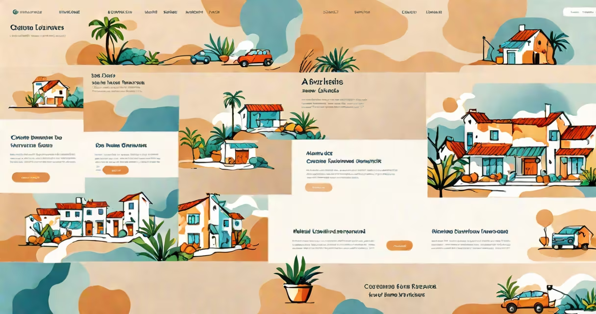
A landing page layout is a structured design that guides visitors toward a specific action, such as signing up or buying. It typically includes a headline, subheadline, supporting images or videos, benefits or features, social proof, and a clear call-to-action button.
The layout of a landing page aims to minimize distractions and focus the visitor's attention on the desired action. This is achieved through careful placement of elements, use of contrasting colors, and strategic use of whitespace.
For example, a common layout places the headline at the top center of the page, followed by a subheadline and a high-quality image or video. The call-to-action button is placed prominently below these elements, often in a contrasting color to draw attention.
| Type | Description | Example Use Case |
|---|---|---|
| Lead Generation | Designed to capture visitor information through a form. | Sign-up forms for newsletters or free trials. |
| Click-Through | Directs visitors to another page, such as a product page or checkout. | Promotional pages for new products or services. |
| Sales Page | Focuses on selling a specific product or service. | Product pages with detailed descriptions and pricing. |
Landing pages are used in various contexts, including advertising campaigns, email marketing, and social media promotions. They are designed to convert visitors into leads or customers by providing a focused and relevant message.
For instance, a company running a Facebook ad campaign for a new product would direct users to a dedicated landing page that highlights the product's benefits and includes a call-to-action to purchase.
One common misconception is that a landing page is the same as a homepage. While both are important, a landing page is specifically designed for a single purpose or campaign, whereas a homepage serves multiple purposes and audiences.
Another mistake is overloading the landing page with too much information or too many calls-to-action. This can confuse visitors and reduce conversion rates. A clean, focused layout with a single call-to-action is generally more effective.
Consider a landing page for a new fitness app. The layout might include:
This layout aims to quickly convey the value of the app and encourage visitors to sign up for a free trial.
To ensure a landing page layout is effective, it's important to test different versions and analyze the results. Tools like A/B testing can help determine which layout, headline, or call-to-action performs best.
For example, a company might test two different headlines to see which one results in more sign-ups. By analyzing the data, they can make informed decisions about how to improve their landing page for better conversions.