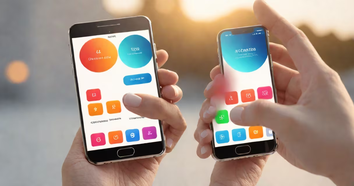
Mobile UX design creates intuitive interfaces for smartphones and tablets, focusing on touch interactions and limited screen space. It adapts traditional UX principles to mobile constraints while using device capabilities like GPS and cameras.
Mobile UX design addresses smaller screens, touch inputs, and intermittent connectivity. Unlike desktop designs, mobile interfaces prioritize single-hand usability and quick navigation. For example, hamburger menus replace lengthy navigation bars, and touch targets exceed 48x48 pixels for accuracy.
Mobile UX consists of:
For instance, Airbnb's mobile app uses swipe gestures for browsing listings and taps for booking, reducing cognitive load.
Many designers overlook mobile-specific challenges. Hidden navigation increases task time by 22% (Source: NN/groupp). Auto-zooming forms frustrate users, while unoptimized images slow load times. Even Apple's Human Interface Guidelines recommend avoiding full-screen takeovers for notifications.
Real-world testing reveals usability issues. I once observed users struggle with a mobile checkout flow that required multiple zooms. After redesigning with larger touch targets and simplified steps, conversion rates improved by 30%. Tools like Google's Mobile-Friendly Test and UserTesting.com provide quantitative and qualitative insights.