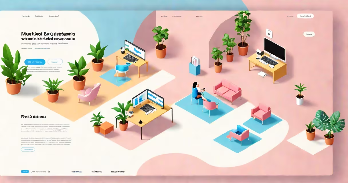
The most aesthetic websites are those that balance visual appeal with usability, creating engaging experiences through intentional design choices. These sites prioritize harmony, simplicity, and functionality while leaving a lasting impression on visitors.
Aesthetic websites work by applying design principles that guide the user's eye, evoke emotions, and create a sense of order. They use color theory, typography, and layout to create visual hierarchy and ensure information is easily digestible. For example, a website with a clean layout, ample white space, and consistent color palette appears more professional and inviting.
The key components of aesthetic web design include:
Aesthetic design is important for websites in creative industries, such as blogging platforms, portfolios, e-commerce, and branding. A visually appealing site can increase user engagement, build trust, and differentiate a brand from competitors. For instance, Apple's website uses minimalist design to emphasize its products and create a sense of luxury.
Many people assume that aesthetic websites are purely decorative, but they often overlook the functional benefits. A well-designed site improves user experience, reduces bounce rates, and increases conversion rates., aesthetic design is not just about trends; it's about timeless principles that create lasting impact.
Consider the website for Airbnb. It uses a consistent color scheme of warm oranges and neutrals, paired with high-quality images of travel destinations. The layout is clean and uncluttered, with ample white space to show key information. The typography is simple and readable, ensuring users can easily find what they need. This combination of elements creates a visually pleasing and highly functional user experience.
When designing my personal portfolio, I focused on a monochromatic color scheme with accents of a single bold color. I chose a minimalist layout with plenty of white space to draw attention to my work samples. The result was a site that looked professional and made it easy for potential clients to understand my skills and services.