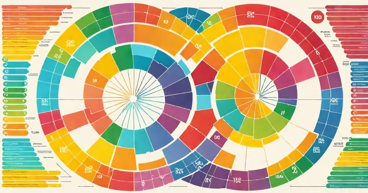
The elements of color are the fundamental properties that define how colors appear and interact: **hue**, **saturation**, and **brightness**. These attributes combine to create the vast spectrum of colors we see.
Every color can be described using these three dimensions. Imagine hue as the color's position on the color wheel (like red or blue), saturation as its intensity (vivid vs. muted), and brightness as its lightness (light vs. dark). Together, they form a three-dimensional color space.
For example, a bright red rose has high saturation and brightness, while a deep burgundy wine has lower saturation and brightness but retains the same hue. This system allows precise color communication in design, art, and technology.
| Element | Definition | Example |
|---|---|---|
| Hue | The pure color on the color wheel (e.g., red, green, blue) | A sunset's orange hue |
| Saturation | The intensity or purity of the color | A vibrant emerald vs. a muted olive green |
| Brightness | The lightness or darkness of the color | A pale pink vs. a deep magenta |
Designers, artists, and marketers use the elements of color to evoke emotions, guide attention, and create harmony. For instance, high-saturation colors demand focus, while low-saturation tones feel calming. Brands like Coca-Cola use bold hues to stand out, while luxury brands often prefer muted tones for sophistication.
In nature, colors signal warnings (bright reds in poisonous creatures) or attract pollinators (vibrant flowers). Understanding these elements helps in creating effective visuals across industries.
Many confuse "tint" and "shade," assuming they're the same. A tint adds white to a hue (making it lighter), while a shade adds black (darkening it). For example, pink is a tint of red, while maroon is a shade of red.
Another mistake is overlooking brightness in favor of hue and saturation. Brightness drastically changes perception-imagine a neon yellow (high brightness) versus a dull yellow (low brightness). Both share the same hue but feel entirely different.
When designing a logo, a brand might start with a primary hue (say, blue for trust). To make it pop, they increase saturation. If the design feels too harsh, they reduce brightness slightly. This balance ensures the logo remains recognizable and visually appealing under various lighting conditions.
I once tested this while redesigning a client's website. Their original logo used a low-saturation blue that appeared washed out on mobile screens. By adjusting the saturation and brightness, the new version stood out while retaining brand identity.
The elements of color provide a structured way to manipulate and understand visual impact. Whether in art, design, or nature, mastering hue, saturation, and brightness unlocks endless creative possibilities.